Decision: logo change

Decision proposal:
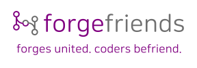
Change the forgefriends logo to
forgefed-logo-concept-slogan-alt
Consensus period: 2021-11-24T23:00:00Z2021-12-08T23:00:00Z


Bonjour,

With the name change forgefriends, @aschrijver also proposed the logo is changed. This proposal received positive feedback and there is an ongoing discussion to fine tune it. I feel like there already is consensus on the logo change, although it is not yet final. Do people think it is worth waiting for potential objections? Or could forgefriends immediately start using this logo?

forgefed-logo-concept-slogan-alt

Cheers

1 Like

@aschrijver could you please add a high definition version / vector version of the logo here?

Here is the logo design as I have it in Inkscape:

forgefed-logo-concept-slogan-alt

The font that I used is NanumSquareRound (which is on my Ubuntu system by default I think). If you don’t have this font, then I could turn text into curves.

The colors used are #800080 purple and #666666 grey (rgb hex).

You can use SVGOMG - SVGO's Missing GUI to optimize the SVG.

1 Like

Could not the period be replaced by another character ?

I don’t know what would be a good replacement. The slash ‘/’ char is much too ‘breaking’ and rather ugly. The ‘⇋’ char is hard to read in small text, and probably not suited for screen readers. An ’ → ’ arrow is possible. But is it needed? When you type the slogan somewhere you need to dig in the unicode table to find it or remember the char-code.

So I will make a case for the current slogan:

  • It is a statement of two simple facts that are project objectives: 1) Forges united, technical. And 2) Coders befriend, social.
    • Point 2) already follows from 1) without need to make it more obvious.
    • Forges united [via proxies] [hence] Coders befriend [via social interaction].
  • It is a simple text, easy to remember, and you can just type it quickly.

PS. On the forum there should be a logo variant without the slogan. Byline text is too small, and the main logo can use some more space.


This is just a :stuck_out_tongue_winking_eye: I would not do it. You might have a slogan such as: forges.unite() { coders.befriend; }

1 Like

It’s actually very difficult to answer this question in a sensible way, sorry for asking :sweat_smile: Let’s be consistent instead and start a two weeks consensus period starting now. Although the logo is now in place everywhere, there is nothing preventing a revert of that change if someone objects and a vote goes against it.

1 Like

It’s been over two weeks and there was no objection. The logo was changed.